How to Compose a Landscape Photo (skillful picture design)
After viewing several websites and referring to a few books, I wrote this post to give you the essentials on how to compose a landscape photo. I plan to update and revise this post as I learn more. But for now, here goes:
What is Photo Composition?
Composing photos is the process of designing pictures to communicate ideas and feelings to your viewers, clearly and artistically.
In other words, photo composition is the language that enables your photos to first capture attention and then engage the viewer, by arousing their emotions. It’s the language that enables your photos to move your viewers, to stir their souls.
Tim Fitzharris, the eminent nature photographer, observed,” composition is the key that unlocks the emotions of the viewer. “
As such, composing photos requires a new set of skills that are quite distinct from the technical skill of correctly operating your camera.
But take heart. You can master how to compose a photo by learning some basic concepts of design and aesthetics, by studying the works of great photographers, and most importantly, by committing yourself to a regimen of routine and consistent practice of composing your own photos out in the field.
The Benefits of Gaining Skill at Composing Photos
Gaining skill at photographic composition will improve the quality, appeal and profitability of your photographic art.
Skilful composition enables you to create photos that grab attention, or in other words, to create photos that pop. It enables you to create photographs that grab the viewer’s attention, that really jump out at them.
Skilful composition helps you to capture the moment. Skilful composition enables you to really capture the moment, the feeling, and the experience that you seek to capture in your photos.
Skilful composition adds charm, quality and aesthetic appeal to your photos. By honing your skill at compositing photos, you’ll be able to produce photos that people love.
With skilful photo composition, your photographs will age well. Your landscape photographs will take on an enduring, timeless appeal that never goes out of style, and that transcends current fads.
Your photography will sell. All of the above benefits contribute to an additional benefit – marketability. Once you acquire some level of skill at photo composition, you’ll be able to produce photos that sell.
The Building Blocks of Skilful Photo Composition
Now I’m going to cover the following techniques that will comprise a significant part of your skill set.
Learn to See, Photographically
Create a sense of depth
Focus on a single point of visual interest
Limit the Depth of Field
Bring together multiple points of interest as an effective ensemble
Frame the point of visual interest
Impart Symmetry
Ensure Balance
Show Contrast
Suggest or Display Leading Lines
Arrange Patterns and Repetition
Include Negative Space
Exploit Shadows
Find an Aesthetic Sense of Proportion and Geometry
Create Dynamic Tension
Eliminate distractions
Emphasize your Message in Post production
Learn to See, Photographically
Novice photographers are very often disappointed by how their photos turn out, even the photos that are technically perfect. This usually happens because they haven’t calibrated their eye. They haven’t yet calibrated what they see through their eyeballs and their mind’s eye to match how the real world is recorded by the optics and electronics of their camera.
The ability to anticipate what the lens and camera will record, and then to make that correspond to what you really see, faithfully, is a formidable challenge, even for the most accomplished of photographers.
But it’s an ability you can acquire. With effort. And once you do, you will become elite.
You need to go out and gain experience in the field, and continuously back that up by conscientiously reviewing your work. Through this continuous feedback, you will improve your work over multiple iterations.
Meanwhile, you will calibrate your eye to better anticipate what your lens and camera are capable of recording.
There is no other way.
Create a Sense of Depth


I think the most powerful thing you can do to improve the composition of your landscape photography, is to create a sense of depth.
What I mean by sense of depth is a sense of spatial depth in three dimensions.
By creating a sense of depth, you draw your viewer into a voluminous, three dimensional world.
There are several ways of creating a sense of depth in landscape photos.
One way is to include three elements that recede into the distance — one in the foreground, one in the middle ground, and one in the background.
You can arrange your compositional elements in the foreground, middle ground and background to overlap or stand out in their own separate space.
Another way is to provide converging lines of perspective as visual cues. We’re all familiar with the artificial converging lines along the length of a pier, or down a straight run of railway tracks. The lines need not be so obvious to communicate space and perspective. In fact, you can find converging lines conveying a sense of depth almost everywhere in nature, both subtle and obvious. Start looking for them to bring into your landscape compositions.
A meandering river provides a good example. The river bends become smaller as the river meanders off into the distance.
Look at the famous photo by Ansel Adams of the Grand Tetons, “The Tetons – Snake River.” 1941.
Whether obvious or suggested, real or imaginary, continuous or not, converging lines show spatial perspective.
You can also make use of objects in a series that recede in size with distance. Their scale will converge to a vanishing point, to impart a sense of depth.
You can also use aerial perspective, or atmospheric perspective, to create a sense of depth.
For aerial perspective, you arrange your photograph so that the more distant elements and landmarks recede into haze, into a bluish color cast, into muted color, into the mist, or into the smoke or fog..


Focus on a Single Point of Visual Interest


A reliable way to compose a winning photo is to create a single point of visual interest.
There are countless ways to do this.
You can use color. Warmer colors tend to be more attractive. Warm reds and oranges will attract the viewer’s eye towards a point of interest.
Conversely, cooler colors, blues, grayish blues and greens, tend to mute or diminish the attraction power of the elements in your photo composition, to help focus interest on the warmer colors.
In other words, bathe the point of interest in a pool of warm light surrounded by a cooler background. You can often do this artificially, in post production.
Or you can wait for the golden hour, and have everything set up so that the setting sun illuminates your point of interest with its warm light.
At night time, or during the blue hour, you may be able to paint your point of interest with warm light from an LED lamp, while everything else is lit by the cool blue of the twilight sky.
For example, when photographing mountain ranges, you often want to focus attention on snow capped peaks. During the golden hours, find a scene where sunlight bathes the rock faces and snow fields of the mountains in the warm light of alpenglow.
Irrespective of color, you can also draw the viewer’s eye towards a subject in your photograph where there is brighter light, or more intense illumination.
Limit the Depth of Field


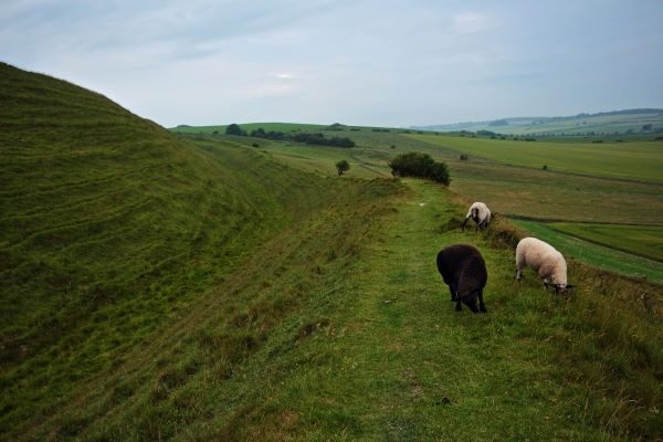
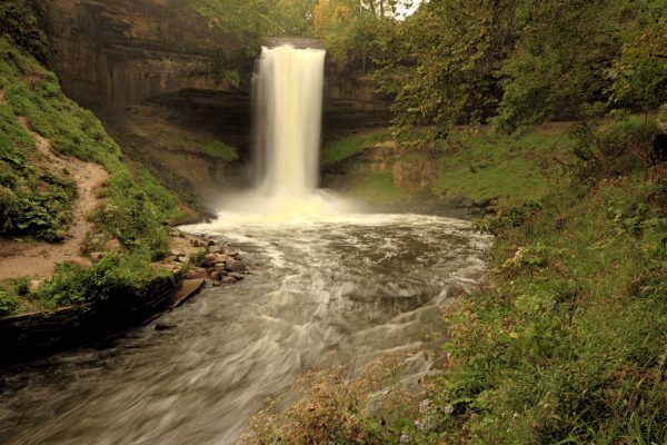
By using a wide aperture and shallow depth of field you can create a point of visual interest through selective focus. What you do is limit the depth of field to the object of interest, bringing it into sharp focus while blurring out the rest of the scene, both foreground and background.
I rarely, if ever, use this in landscape photography, so I certainly have some experimenting to do. But I religiously use a shallow depth of field for wild flower portraits, where the background flowers are blurred out into pleasing blobs of color.
I’ve only mentioned color and focus as ways to set apart a point of visual interest. You can use leading lines and many more techniques to draw the viewer’s eye to the point of interest. There are countless possibilities. I’ll discuss framing, contrast, patterns, texture and more, below.
Create an Effective Ensemble of Multiple Points of Interest
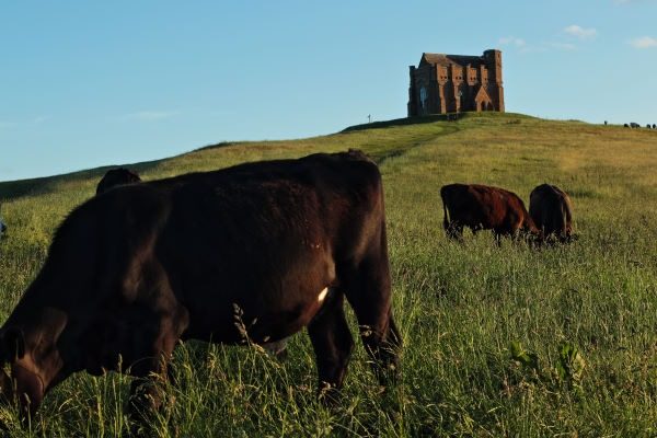

You don’t need to limit your photographs to a single point of interest. Experiment and see.
It can be quite effective to feature three points of interest in your composition. What can be particularly effective is to arrange those three points of interest into a clear geometry, say a triangle, or a continuous curve, or straight line.
Frame the Subject of Interest
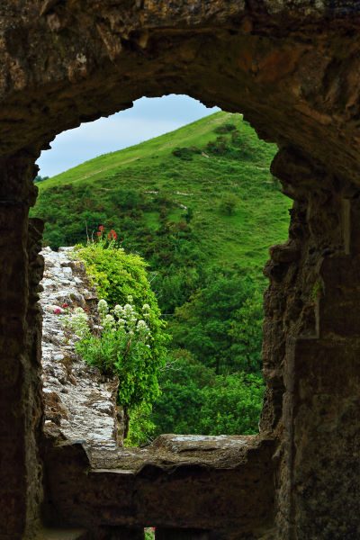
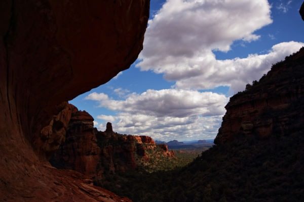
Beyond using color, illumination, focus, leading lines, and geometry, you can frame the main subject of interest within other elements of your composition.
You can use pretty much any other object in your composition to frame the subject of interest.
You don’t always need four sides of a frame. You can often create an effective composition frame with only two or three sides. Maybe even one side and a bit of another side.
You choose to merely suggest the existence of a frame.
The point is to confine the viewer’s interest and focus enough to create the impact you have in mind.
Impart Symmetry
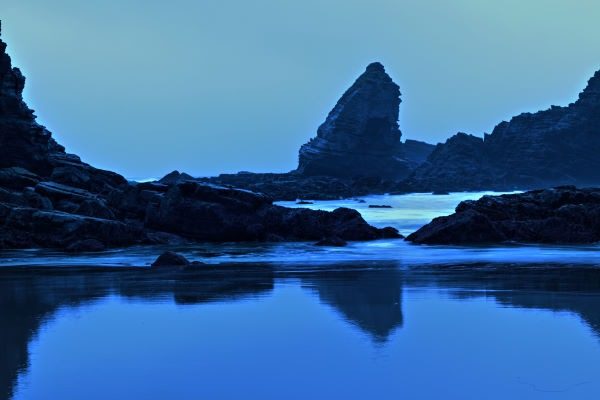
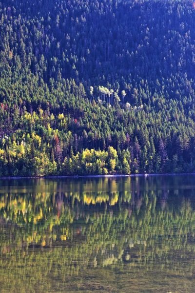
The next tool, or technique, is the ability to impart a sense of balance and symmetry.
The most overt way to do this is to include some sort of mirror effect, or reflection, perhaps with a reflecting body of water.
Another way is to compose the elements in your picture on either side of an axis of symmetry. For example, you may compose your photo with a similar number of trees or mountain peaks on either side of a photograph.
Wes Anderson is the champion of compositional symmetry from the movie industry.
Ensure Balance
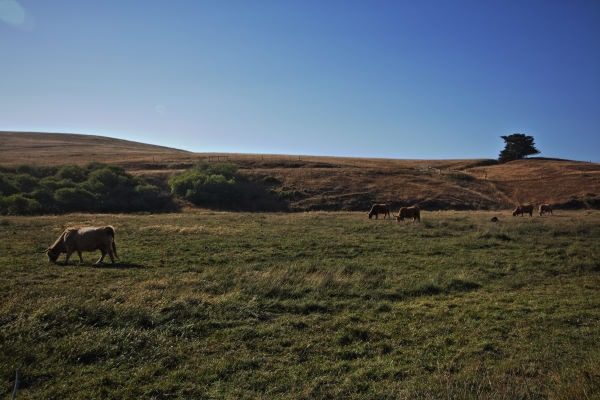

Something that can be far more powerful than visual symmetry is to ensure that your composition adheres to a sense of balance.
You ensure that your composition evenly distributes its visual weight on either side of a photograph.
For example, you might arrange to have very large objects, that are light in tonality, or warm in color, on one side of your frame. Then you balance those with counterparts on the other side of the frame that are dense, dark, cool, yet compact in size. As a result, the visual weight of the objects on either side are able to strike a balance by keeping the sense of visual weight in balance with respect to the center.
Show Contrast in Photo Composition


Let’s consider some contrasting elements for your photo composition to evoke strong emotions and gut reactions, or to stir up a specific feeling in the viewer.
The “big guns” of contrast are color, texture, tone, shape, form and concept.
Color contrast – complementary colors from opposite sides of the color wheel, e.g. blue versus orange, red versus green, yellow versus purple
Texture contrast – e.g. smooth versus rough, hard versus soft, fine versus coarse, wavy versus straight (hair)
Tonal contrast – e.g. contrast between bright highlights and dark shadows
Shape and Form contrast – e.g. round versus angular, straight versus crooked, big versus small
Subjective or Conceptual contrast – old versus new, happy versus sad, living versus dead, artificial versus natural
Leading Lines
Earlier, we looked at how we can use converging lines to create a sense of depth. Converging lines are a specific type of leading line.
More generally, leading lines can create spatial unity and continuity.
As before, the leading lines need not be clear, obvious, or continuous. Often their effect is more powerful, more effective for the viewer, when the leading lines are subtle, merely suggested, or incomplete. They can also be circular, or wrapped in a loop. Alternatively, they can be open ended, straight, wavy or jagged. You can often rely on the viewer’s eye to complete the line or loop.
Use them to draw the viewer’s eye to points of interest or to confine their gaze.
Arrange to have Patterns Emerge from Repetition
There’s lots to discuss about how patterns and higher forms can emerge from the repetition of simpler forms. I’ll try to be brief.
There are repeating shapes and forms everywhere in nature on every scale. Consider mud cracks, sand ripples, waves, surf, sand dunes, river deltas, tidal flats, mountain ranges, clouds patterns, mosaic cow pastures, strip lynchets and more.
Now consider how you might portray these repeating phenomena in your composition to showcase the beauty, perfection, expansiveness and wonder of nature.
My favorites are ripples left in sand.
Exploit Shadows
Shadows bring out the depth and three dimensional form of the elements in your landscape composition. While a fully illuminated mountain range or canyon wall may appear flat and two dimensional, shifting the light to the side will bring out features like spurs, valleys, and massifs into full relief.
In classical paintings, the artists used a technique known as chiaroscuro to bring out forms into high relief, three dimensional relief. It’s basically the technique of shading and highlighting, i.e. adding bright highlights that transition to deep shadow, to make the forms in your composition look three dimensional.
Leonardo da Vinci pioneered chiaroscuro and then mastered it. Michelangelo Merisi da Caravaggio took the technique to a whole new level. The Dutch masters, Rembrandt van Rijn and Gerard van Honthorst, also used chiaroscuro in their work, yet perhaps more subtly and creatively than their Italian mentors, to create mystique and drama. You can gain a ton of inspiration for your photo composition by studying the works of da Vinci, Caravaggio, Rembrandt, van Honthorst, Johannes Vermeer, Joseph Wright of Derby, Georges de la Tour and many more of the classical masters.
How shadows are cast by objects onto wide areas of your composition can also be used to great effect.
Appeal to the Aesthetic Sense of Pleasing Proportion and Geometry
What we’re talking about here are the classical layouts for creating a composition to yield a landscape photo that is both pleasing and interesting.
We’ll begin with the easiest one to remember, the rule of thirds.
What you do is divide your picture frame into thirds, horizontally and vertically. Two horizontal lines divide your frame into three horizontal rows, and two vertical lines divide your frame into three vertical columns.
In other words, you divide the frame into a tic tac toe grid.
Now put the important element of your composition at one of the four points where the dividing lines cross.
Alternatively, line up the important element along one of the dividing lines.
(In a portrait, you would position the eyes or face at one of the intersections and have the body line up along one of the lines.)
In a landscape composition, you would generally line up the horizon along either the upper or lower horizontal lines. A third of the scene would lie above the horizon and two-thirds would lie below, or visa versa.
I’m not exactly sure how the rule of thirds works, aesthetically and psychologically, but I know that it’s effective. It’s kind of like gravity. Your eye is pulled off center as you look at the composition. So the rule of thirds acts like a kind of elastic band for your attention.
When you initially look at a picture, your gaze is directed at the center of the frame. If that is where the most important subject of visual interest happens to be, then you don’t have to shift your gaze.
However, if the photographer has moved the subject a little bit to the left or right, then you, the viewer, must naturally move your gaze away from the center.
That contributes to the aesthetic appeal of the composition.
In the first photo below, you see a massive, columnar, saguaro cactus standing in the middle of the frame.
In the second photo, the same cactus is displaced a little to the side, according to the rule of thirds.
Now in the first photo, I get the uncomfortable feeling that the cactus is standing in my path, which doesn’t appeal to my sense of aesthetics.
In the second photo, it’s clear that the saguaro cactus is the central subject of interest in the photo, but it doesn’t seem as foreboding, or at least, not as obnoxious, as in the first photo. In fact, it seems to become part of a kind of a harmonious whole, while at the same time drawing the viewer in and along the desert trail just to the side of the cactus.
In both photos, we have the same subject matter, but we enjoy far greater aesthetic appeal in the second case, simply by moving the subject of interest off center so that it isn’t as acutely in your face.
You can align and position your compositions according to a whole raft of classical line patterns. The big three are the Rule of Thirds, the Golden Ratio, and the Fibanacci Spiral.
Some camera apps let you overlay these line patterns on your viewfinder.
Now you can go off and experiment with the rule of thirds, the golden ratio and other compositional layouts. Find out what works!
Again, I don’t know precisely why these layouts work, but I do know that they have withstood the test of time.
Negative Space
Using negative space to your advantage is something that dovetails nicely into the rule of thirds, et cetera.
Compose your photo with unequal regions of negative space behind your subject. That will make the overall composition more interesting than if all those regions were similar.
Consider an apple that fills up most of the frame. When perfectly centered you get equal background space in all four corners of the frame. The result is humdrum and boring, perhaps even discordant, because the areas of negative space behind the subject are so similar.
On the other hand, moving the apple off center to abide by the rule of thirds will render the regions of negative space dissimilar so they contribute to the aesthetic appeal of the composition.
You must also consider the overall proportion of negative space in your composition. You need a fair amount of it for two reasons. First, it provides eye relief from excessive detail. Second, it ensures that the composition is kept reasonably clean, simple and clear.
In other words, negative space can prevent distracting elements from maring your composition, or from diminishing or blunting the visual impact of your photo.
Eliminate Distractions
Distraction Alert!
A key habit in composing your photo is to survey the entire field of view for any elements that might distract from the main message that you are trying to convey.
You want to eliminate all distractions.
Exclude all photobombs!
Sometimes you can simply walk over to the piece litter, stick, or whatever bit of detritus that might be maring your view. Otherwise, you can often move the camera to clean up your point of view.
You want to avoid having to crop, reframe or edit out the distracting rubbish and photobombs in post production.
An extremely effective habit to cultivate is to test several points of view during the live photo shoot. This will pay dividends in helping you achieve a clean, unified, cohesive theme in your composition, without any extraneous rubbish or distracting features.
If the distracting subject happens to be an unavoidable tourist or bystander, the next thing is to arrive at the shoot earlier in the morning, or wait until they casually move out of the way.
Remember that a lot of composition can be achieved and perfected in post-production.
But!
The earlier on in your work flow that you consolidate and finalize the elements of your composition, then the least amount of effort and time you need for making corrective edits.
Post Production
In current editing software like Lightroom, Photoshop, Photodirector, or GIMP, you can replicate all that was done in the darkroom, back in the day of photographic film and printing enlargements.
You can crop images, use a brush or gradient tool to burn-in specific areas, increase the effect of exposure, optical density, color saturation, image density or whatever you like.
You can also dodge-out or brighten specific areas, et cetera, again, using a digital brush or gradient tool. These tools are available in all of the mainstream image editing software packages.
Important Notes on Post Production!
You have a lot more latitude to modify your compositions with these tools if you begin by recording all your photos in the most data rich format you can, normally the “raw” mode for your camera.
It also helps immensely to bracket your exposures, to ensure that the highlights aren’t overexposed, or “blown out” while details in the shadows aren’t underexposed, rendering them noisy or grainy.
Again, keep in mind that you can alter the color saturation, contrast and sharpness of the image in post production. But you need to begin with a photo that is exposed well enough to record the color, and that is focused sharply to record the detail.
Bear in mind that in post production you can increase or decrease color temperature, color saturation, sharpness, relative exposure or brightness in specific areas, in order to either bring attention into those areas or diminish it, in the interests of effective picture design.
How to Develop Your Skill at Composing a Photo
For every hour that you spend reading blogs and reference books on photo composition, and for every hour you spend studying the classic photo composition of the masters, make sure that you spend at least 3 hours out in the field capturing your own photographs where you can hone your own skill at photo composition.
It’s certainly a good thing to study photo composition, but you really need to practice, to execute, to implement what you learn, for any of it to stick.
Yes, you need to gain knowledge. But you also need to convert that knowledge into skill through practice and execution, until it becomes intuitive or second nature.
Interesting YouTube Channels
The Photographic Eye – Alex Kilbee
Serge Ramelli Photography
Visualizing Scotland with Kim Grant
Mads Peter Iversen
Mark Denney
Nigel Danson
Dave Morrow
Gary Gough
Photo Tom – Toma Bonciu
Landscape Photography IQ – Tom Mackie
Interesting Books
Here are some books that delve into photographic composition for landscape photography:
Nature Photography, by Tim fitzharris. Published by Firefly books.
The Better Photo Guide to Digital Nature Photography, by Jim Miotke, published by Amphoto Books.
Mountain Light, by Galen Rowell, published by Sierra Club Books. This is a large format book
Landscape Photography, by John Shaw. Published by Amphoto. Another large format book.
The Field Guide to Photographing Landscapes, co-authored by Alan Rohac and Anne Millman, published by Amphoto.
The Landscape Photography Book, by Scott Kelby, published by Rocknook.
